How to Choose the Best Typeface for Your Website
By: Morgan Withee | 4/28/21
Choosing the right font shouldn't be a guessing game
“I think this font looks okay, let’s just go with it.”
Now, you could find a font this way. Sure, sometimes this method works, and you score the perfect typeface for your brand on the first try. Unfortunately, it’s not the best approach to finding a font that complements and embodies your brand message and aesthetic. Just because you like a font, doesn’t mean it will fit your company’s brand.
Before we dive into the vast font multiverse, just note that when referring to a “font” you are actually referring to a specific style within a typeface or font family. For example: you choose the Arial typeface that includes Arial Regular, Arial Bold, Arial Italic, etc. Those are the “fonts”; Arial is the “typeface” or font family. However, for the purposes of this post, we can just call them fonts because that is a more widely recognizable term.
Here are a few things to keep in mind when you’re looking for that perfect font or two
Who are you?
Even if this seems obvious, “I’m a financial organization,” “I’m an automotive company.” Okay, fair enough. But what I’m asking is, what kind of personality does your brand have and what aesthetic or vibe are you going for? How do you want your customers to feel when they enter your website, stores, and interact with your brand? A simple way to figure this out is to just create a list of adjectives that describe your brand as a whole or even create a mood board of different imagery and inspiration to get you started on this overall aesthetic if it doesn’t immediately come to you. This is a great exercise in the beginning stages of font exploration so you can begin to compare your font(s) next to your overall aesthetic. Even if you have a brand guide, this can still be a worthwhile exercise for you to get started.
Who are your users?
I know this might seem like it has nothing to do with your font, but nonetheless it’s an important piece of the puzzle: who are your users and what are they coming to your website for? The reason this is important is because you need to provide the right kind of experience for your user base and fonts can have a lot to do with this.
For example, we’ve worked with a client who provides education and job opportunities for legally blind and visually impaired individuals. In order to ensure the online experience meets the user’s expectations and their specific needs, we had to use a font that was large enough, legible at a smaller scale and something that still feels friendly and inviting to these users who are seeking their help. All while also adding a level of professionalism for the sponsorship side of things. It’s a delicate balance, but not impossible.
Legibility is key
Regardless of who your users are, they might not be visually impaired like the example above, but they are typically someone in a hurry to find information or come to your website and skim the information to see if they will even give your website the time of day. Everyone’s time is precious so let’s not waste theirs with terrible, hard-to-skim type!
According to Statisticbrain.com, the average attention span only lasts about 8 seconds. A users first impression of your website? They’ll make a decision about you in .5 seconds. That’s right, .5 seconds! A typical user coming to your site for the first time might get frustrated and leave within the first 10-20 seconds if they don’t find what they’re looking for. If “first impressions” happen within the first .5 seconds, your website design needs to be captivating and professional to hold their attention. But to keep them engaged and drive them further into your site, they need a seamless architecture and legible font in order to continue on.
If the font is the bread, your design around the font is the butter. If you have a lousy, hard-to-read font, you will in turn have a lousy design. If a user can’t easily read what’s on your website, you’re doing you and your users a disservice regardless of how “pretty” and “modern” your design may appear upon first glance (.5 seconds). For this reason, and this reason alone, font legibility should be a major factor while you are choosing a font for your website or brand.
Choose a web safe font
There are many free web safe fonts out there that also come with font files for print. I would recommend Google Fonts or if you have an Adobe account, Adobe Typekit is great. Fonts.com can get pricey depending on the font and the package as well as the amount of traffic you get to your site. There are plenty of other resources out there, but we’ve found Google and Adobe to be less problematic and hey, Google hands out free licenses. Free things are nice.
Choose a typeface with multiple fonts
Remember at the beginning when I specified what a typeface is? The font family or type face you choose can have any number of fonts within it, or only 1. You can usually see how many fonts come in a font family by looking through the specs. This is important because you want to find one that provides different styles to give you more freedom with headings and different content types throughout your website design. Example: Regular, Italic, Medium, Medium Italic, Bold, Bold Italic, Black, Black Italic would be a nice group of fonts in your chosen font family. Some fonts just provide Regular and Bold – that’s fine as long as you understand your limitations and are going for a simpler/minimalist look and feel! That’s your prerogative. You do you.
Font mixing can be dangerous or the greatest thing ever
Finding a font is one thing, but finding 2 fonts, or even 3 fonts that work well together is a totally different ball game. While it might seem challenging to find a font that perfectly mixes with your existing or preferred font, I have a few key tricks that help me. First things first, make sure to pay attention to X heights. The x-height, if you can picture it, is the invisible line that runs on top of the lowercase letters (hence the term x-height, it’s basically the height of the x and letters like it, unlike a t or an l that extends that height.) When combining fonts, it might help you narrow down your choices by comparing the 2 (or 3 fonts) x-heights. If they are similar, it’s probably a better pairing as it’s more aesthetically pleasing and feels like they relate to one another even if they are very different. That’s not to say having different x-heights is wrong but this is certainly a tip I would take into consideration to provide a seamless reading experience for your users and an online brand that feels cohesive.
On that note – just because fonts look alike does not mean they belong together. When font mixing, your font choices need to be different enough, so it doesn’t look like your front-end developer accidentally used the wrong font in some areas of the site and the correct one in other areas. There needs to be purpose behind your selection, and they need to have obvious enough distinctions that also complement one another (this is more specific to headings/subheadings but body text too.)
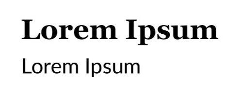
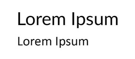
Here is a comparison of an appropriate way to mix fonts, versus an ineffective way to mix them:
Example 1: Heading is a bold serif, Georgia, and the subheading is a medium sans serif, Lato. They are different enough but don’t swear at each other, right? This is a fine combination.

Example 2: Heading is Lato Regular, subheading is Calibri Regular… both sans serif, not too different right? So, why mix if we’re using the same weight and style? These fonts aren’t different enough. You might argue “well both are great, and I want to keep them both.” Okay, but consider the less fonts being loaded on your website, the faster your site will load so it’d be best to choose between them rather than loading 2 separate font families for a similar outcome.

Sans serif & serif fonts
Some serif body fonts work well with sans serif heading fonts and vice versa. However, there are numerous claims serif fonts are harder to read on the web. This was the case in 2005 when our monitors didn’t have the pixels per square inch that they do today. In 2021, we have better screens and modern serif typefaces for that matter! The world of fonts is your oyster, don’t let sans-only people rain on your sans-serif parade.
Display fonts & smaller fonts
If the font you choose is really meant to be a headline or display font, then use it as such. Don’t force it into being a body text or small font, and vice versa. Headline fonts are designed a certain way so that they look best at a larger scale, and same with smaller, body text fonts. If used at a large scale, they look alright, but they’re typically not meant to be blown up real large. So, keep this in mind because you might not be choosing multiple font families just for different heading styles and aesthetics, but selecting a few that make sense for the content. (This is not to say you can’t find fonts out there that work for both headlines and body text – you absolutely can!)
It can be daunting to pick the perfect font for your website, especially if you are just getting started on a website transformation. I hope that you have gained valuable insight on some of the dos and don'ts of digital typography that you can utilize on your website. If you’re looking for more information on this topic or want a free web consultation, please contact us and we would be happy to chat about any of your digital needs!
Categories:
UX Strategy & Design

